Where did all the money go?
A couple of weeks ago David Fleming from the Independent Alliance asked me why, if there is so much money in the system are we feeling poorer? He also asked me to comment on the significance of the charts shown on the website wtfhappenedin1971.com, which shows a lot of economic and other indicators falling out of bed from 1971 onwards.
In looking at this question, it is easy to go off into the weeds of monetary theory, but I tried to answer without making too many gross simplifications. I am going to use mainly U.S. data here as they have a very efficient graphing tool that quickly lets you identify the impact of money printing1. Overall many of the conclusions for the U.S. apply to the U.K. as well.
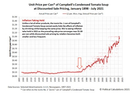
Starting with the 1971 question, that was the year in which the U.S. Government ended the linkage between U.S. Dollars and gold. Up to that point, foreign currencies were pegged to the U.S. Dollar and the Dollar could be converted to gold at USD 35 an ounce. Once the relationship between the U.S. Dollar and a physical commodity, in this case gold, was abandoned then the U.S. Dollar became a “fiat” currency and could be created at will2. 1971 was definitely important, but was really just a step on the “easy money” road with many more significant steps along the way. This is probably the best known chart from the wtfhappenedin1971.com site;
The suggestion is that the price of a standard tin of Campbell’s soup was stable for a very long time up until 1971 and then started to increase rapidly in the decades that followed. This kind of inflation is bad for people’s real (inflation adjusted) incomes.
The simple explanation is that more money printing pushed up inflation in line with Milton Friedman’s pithy analysis that “Inflation is always and everywhere a monetary phenomenon”. This is of course true, but predicated with an “all things being equal” caveat. One of the main reasons that we feel pooper is due to different types of inflation, when you shove fiat money into the economic system it shows up in different places at different times.
There are different ways of implementing easy monetary policies including reducing interest rates, quantitate easing, reducing bank reserve requirements and sending money directly to citizens (helicopter money). I am looking here only at quantitative easing by the Federal Reserve (the Fed) under which Fed buys assets on the open market and lends money to banks. These operation are significant and easy to measure by looking at the Fed’s total assets, which are reported weekly.
The Bernake put
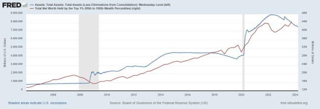
The chart below shows the stunning correlation between the size of the Federal Reserve balance sheet (quantitative easing) and the wealth held by the top 1% of the U.S. households.
As well as the strong correlation, several items stand out for me, firstly the so called Bernake-put (with a put being the right to sell a security to a buyer). The Bernake-put is the idea that when you start seeing a decline in net worth and financial assets (red line), the Fed will step in and provide quantitative easing (blue line) to prop up asset prices and prevent asset owners losing money. The other thing that struck me is the relative size of the 2008-2009 quantitative easing compared to lockdown quantitative easing in 2020. Back in 2008 one trillion USD seemed like a lot of money, but now seems pretty small compared to the vertical USD 3 trillion increase in Federal Reserve assets around the start of lockdown in 2020. The Federal Reserve balance sheet is now around USD 7.5 trillion, equivalent to about 30% of U.S. GDP. Note also the axis value for net worth is trillions of U.S. Dollars (millions of millions), so the top 1% increased their net worth significantly by around USD 15 trillion from the start of the pandemic in 2020 up to around USD 45 trillion.
The chart below shows the same phenomenon but expressed in year-on-year changes and compares the liquidity provided by the Fed (this is more or less equal to the change in Federal Reserve assets) and changes in the S&P 500 index value. Again, there is a clear link between the falls in the S&P 500 and a huge increase in quantitative easing at the start of lockdown in 2020. The huge quantitative easing likely helped push the S&P 500 upwards and the two indicators have tracked very closely since the end of 2021.
Since most corporate equities are held by the top 10% of the population, this positive impact of quantitative easing primarily benefits the 10% with little benefit for 90% of the population3. This effect exasperates inequality as measured by the GINI index and there is a clear correlation between increased quantitative easing and increased inequality.
The important thing to remember then is that money printing creates inflation in both financial assets and consumer prices, the Federal Reserve only however seeks to manage the consumer price element in order to maintain a 2% inflation target, whilst largely ignoring the very significant asset price inflation.4
Housing
In addition to increasing inequality, one of the negative consequences of these differing rates of inflation is that housing can become increasingly unaffordable over time when expressed in terms of years of wages. This pattern is repeated in many countries, here I can use U.K. data which illustrates this trend. This again will create relative winners and losers between older people without mortgages (winners) and younger people trying to get on the property ladder (losers).
The ONS chart only goes back to 1997, and although it may not seem that significant to see an affordability ratio increase from around 3.5 to 8.5, that actually is a huge increase and will mean that owning your own home will be very difficult for many people in the U.K. In addition to monetary easing, there are a number of specific supply and demand factors also at play in the U.K. housing market.
A word about wages
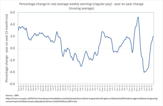
The focus of this piece has been on 1971 and therefore on monetary policy, trends in labour market participation, unemployment and wages are large topics all on their own. For the moment, I am just going to include one U.K. chart which is the year on year change in real average weekly earnings, real meaning adjusted for consumer price inflation. You can see that after the 2008 crash, year-on-year changes in real wages were negative for many years and people really got poorer during that period in terms of their purchasing power. There was another bout of contracting real wages in 2022 after a lot of money printing and the decision to stop buying Russian hydrocarbons. Periods of falling real wages are very rare and very often lead to major dislocations.
Conclusion
Hopefully this has to some extent answered David’s question, specifically when you flood an economy with easy money the effects show up in inflation in different areas of the economy, creating relative winners and losers. Some asset prices in particular tend to inflate, or quickly reflate, and those gains accrue to only a small proportion of the population. This tends to exacerbate existing inequalities as well as making housing increasing unaffordable when expressed in terms of years of average wages.
The theory of monetary easing has been to stimulate investment in capital assets which improve productivity, but in practice it seems that the real impact has been primarily to inflate the value of financial assets. This helps to explain how an economy can be both awash with cash, with a booming stock market and seemingly low unemployment5, whilst a very large section of the population feels poorer.
As a small government libertarian, I generally oppose Government intervention and believe that we are seeing interventions which only seek to limit the damage done by the previous Government intervention. Mass money printing is a case in point, as this was only done in an attempt to offset the tremendous damage caused by lockdowns.
As always, please let me have your comments below.
Thanks
Alex
Alex Kriel is by training a physicist and was one of the first people to highlight the flawed nature of the Imperial COVID model6, he is a founder of the Thinking Coalition which comprises a group of citizens who are concerned about Government overreach (www.thinkingcoalition.com)
https://fred.stlouisfed.org/
https://www.federalreservehistory.org/essays/gold-convertibility-ends
https://www.federalreserve.gov/releases/z1/dataviz/dfa/compare/chart/
https://mises.org/mises-wire/four-charts-show-cantillon-effects
Low unemployment is also somewhat fictitious and heavily impacted by decreased labour participation rates.
https://x.com/ThinkingSlow1/status/1257578069797339137


The elephant can no longer afford to be in the room.
Price manipulation in real estate can also be done via less obvious means. In Germany for example Scientology cultists were very active infiltrating estate agents there the 1990's.
https://neveragainisnowglobal.substack.com/p/black-propaganda
If you have cultists running a substantial part of the show things soon get very distorted and unhinged. An artificial distortion obviously presents enormous exploitation potential at a later date exclusively for those in the know. Those on the outside on the other hand think it's connected to say bad QE policy thereby rationalising the insanity and even playing along.
No one I feel has really explained what's going on with unusually creepy companies like Foxtons in the UK. It retrospect it's almost like they're being run by a secretive cult. Every small town has at least half a dozen estate agents for no apparent good reason. They don't appear to compete with each other - more of a case of locking anyone else out by sheer numbers.
It's like their only real function is just to grossly and artificially manipulate the entire property market in every nation they operate.